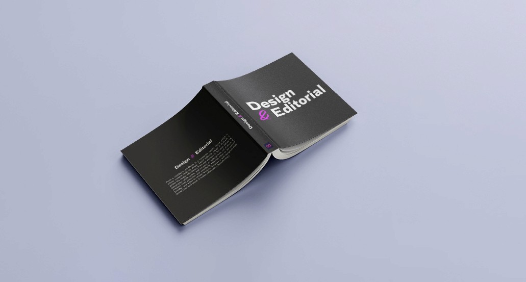
Design & Editorial

Medley of several editorials

From a children's workbook to a corporate report, layout design is where content finds its shape. Good editorial design is invisible, it guides the reader effortlessly from one element to the next, balancing typography, white space, and imagery so nothing feels out of place. It requires both precision and sensitivity: knowing when to let content breathe, and when to create tension. Because a well-designed page doesn't just look good. It makes information feel effortless.
Lamorim

Learning hebrew, one poster at a time
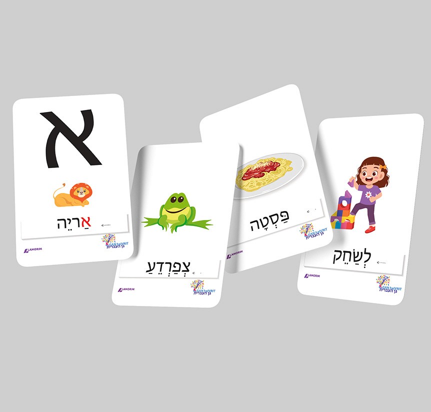
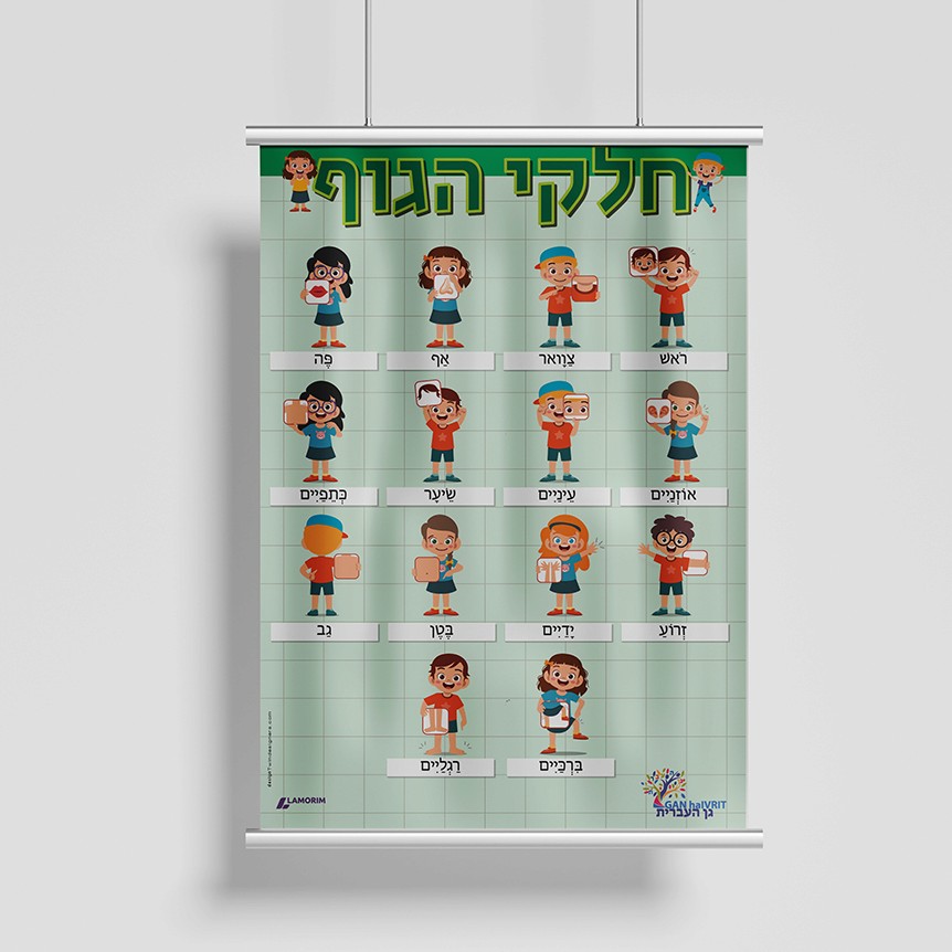
Lamorim approached me with an ambitious brief: a complete set of educational posters and flashcards to introduce Hebrew to nursery school children in France. The challenge was not just linguistic but visual. Every design decision had to speak directly to young children, from the colour palette to the illustration style to the typography.
The subject matter was as varied as a child's world: colours, numbers, food, animals, emotions, body parts, and the rich symbols of the Jewish calendar, Hebrew months and days of the week. Each theme required its own visual approach while maintaining a consistent, cheerful identity across the entire collection.
Each wall poster comes paired with individual flashcards, turning the classroom display into a hands-on learning tool. A dense and genuinely fascinating project, where design had to be both joyful and pedagogically sound.
Lamorim

Art and craft sheets, a toolkit for teatchers
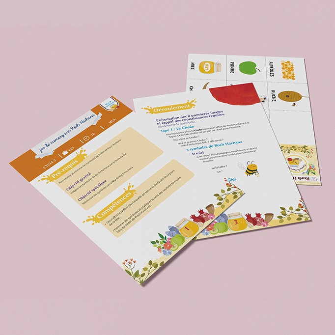
This second project for Lamorim came from a simple, real problem: teachers often run out of craft ideas for Jewish holidays. So Lamorim created a full library of art and craft sheets, one for each major holiday, Chavouot, Hanukkah, Pesach, Purim, Rosh Hashana, Sukkot and Tu BiShvat, adapted to four grade levels: CP, CE1, CE2, and CM1/CM2 combined.
Take the Hanukkah sheet as an example: students create a self-portrait on a spinning top, inspired by Andy Warhol's pop art style. The sheet walks the teacher through everything, prerequisites, learning objectives, skills targeted, step-by-step instructions, even a follow-up activity idea. Real structure, ready to use.
To make all of this work together, I built a colour-coded graphic system to tell grade levels apart at a glance, and adapted each sheet's design to match the spirit of its holiday, like the dreidels and menorah illustrations here for Hanukkah. Above all, the sheets had to be clear. These are tools meant to save teachers time, not add more to their plate.
Lamorim

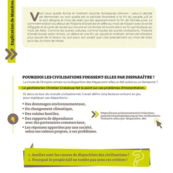
Study sheets. Teaching Rav Manitou to high school students
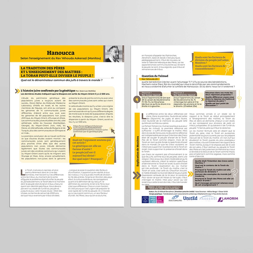
The third project for Lamorim moved into a completely different register: in-depth study sheets for high school students, built around the teachings of Rav Yéhouda Askenazi, known as Manitou, on subjects like Hanukkah and Purim.
The audience called for a more mature visual language. Calmer, more restrained colours, so the reader's focus stays on the text itself, which is dense and needs to be followed step by step, with quotes, questions, and source references woven throughout.
Each subject got its own colour: yellow for Hanukkah, olive green for Purim, and so on. Beyond just organizing the content, it builds a sense of collection, so students recognize and return to the series sheet after sheet.

Create a free website with Framer, the website builder loved by startups, designers and agencies.